Art, Writing, // December 26, 2013
Simplify!
When I was a kid, I loved it when my school took us to Severance Hall in downtown Cleveland to listen to the Cleveland Orchestra. The music was sublime, and it soothed my budding ADD soul.
Before the concert actually began, many of the musicians had to tune up their instruments. A bassoon player played one thing, a violinist played another, and some horn players blared dissonant notes. The resulting cacophony sounded sort of interesting, but nothing went together, and I simply didn’t know what to listen to.
Then, George Szell, the conductor, tapped on the lectern and raised his arms. The musicians paused, and, on cue, beautiful music filled the hall. It was most pleasing to the ear, in part because its melody told a story that flowed its way throughout the piece. That melody, more often than not, consisted of single notes, strung together simply, so simply that a single instrument, a human voice, or a person whistling, could reproduce only it. Our brains love that simplicity, even if the single notes were part of a complex progression.
The melody’s simplicity made it stand out from all the accompanying musical notes. So much so that our ears could not be confused by the accompaniment.
In photography, the SUBJECT is the melody. Successful photographic compositions do not lead the eye here and there. They tend to be simple and contain few, if any, distracting elements.
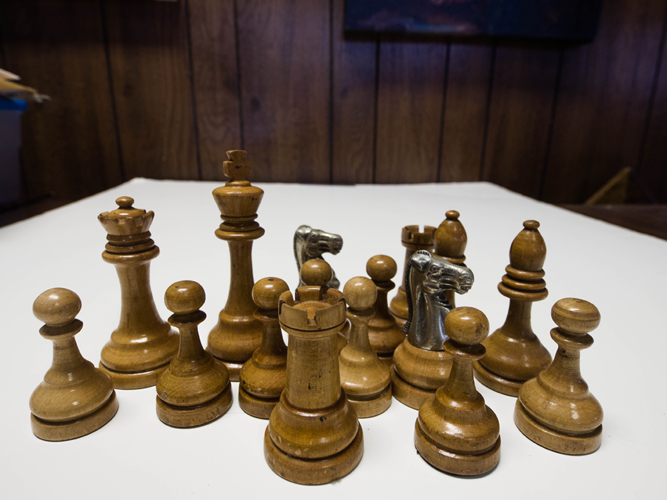
I’m using my late father’s chess set to illustrate this simplicity. The set is quite special. Dad told me that it dates back to the 1930’s and was owned by a master chess player who was a fellow factory worker back in the 1950’s. I never learned his name, but I cherish his old wooden and metal set. Here they are on a piece of foam core board on a table in my office. Where does your eye go?
I don’t know about you, but my eye is struggling about what to really look at. Is it the knight in the right foreground, the queen or king on the left side, or the castle at front center? Note that every piece is in pretty sharp focus, and that there’s a bunch of distracting elements in the background. My eye eventually settled on the closest element to me – the castle at the bottom center of the frame. On the whole, it’s really not that interesting, but, with a bit of editing, could serve as a picture showing the entire set as the subject.
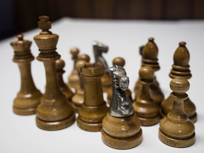
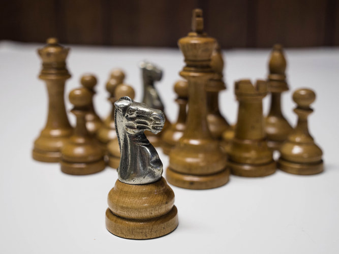
Let’s look two more images.
What’s changed? The knight now is the subject of both images. The first image, however, is a weaker composition. While the knight has the sharpest focus and is a bit closer to the viewer, it seems to fight for attention with the pawn at right and the king at left. I’m having trouble trying to figure out what to look at, and that tires me. The second image is, by far, a much stronger composition. Why? While the entire set is on display, the knight is sharply focused and is in the closest position to the viewer. The rest of the pieces recede in interest and serve to give context to the image and isolate the knight as the subject.
Let’s take these principles a step further.
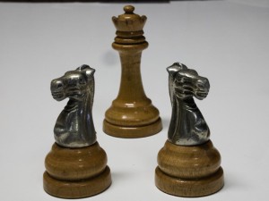
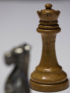
Here, we have three pieces, forming a triangle. Which piece is the subject? Note that, in the left photo, ALL are in focus, even though the queen is behind the knights. The GROUP is the subject. At right, nothing much has changed other than the king no longer being in sharp focus. A smaller group consisting of the two knights now is the photo’s subject.
The next two images take that to an extreme. Your eye goes right to the subject, the knight at left and the king at right. This illustrates position and focus as defining elements. Have you noticed that the number of elements in each of the above images is getting smaller and smaller?
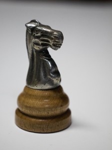
Wow, now we’re down to a single element, and it “fills the frame”! There is no mistaking our subject. The area around the knight serves as “negative space,” clearly isolating the subject. Attaining clear focus on the subject, in almost all cases, is critical to an image’s success.
So what have we learned? Simplify!
If the situation allows, try to:
• Reduce the number of elements within the photographic frame;
• Define the subject by locating it closest to the viewer;
• Manipulate focus, focusing sharply on one element and blurring other image elements; and
• Make sure that your subject is in focus.
My next article will show you HOW to use the camera’s settings and subject position to intentionally blur parts of an image while sharply focusing on other parts. This skill is but one that defines who is a photographer and a person who takes “snapshots.”
Now, go out and take pictures!!
Marc Weinberg is a semi-retired lawyer and a professional photographer in Frederick, MD. Marc picked up his first camera in 1959 and has been at it ever since. He is a juried member of Frederick’s oldest gallery, The Artists’ Gallery, maintains a studio and is a resident artist and instructor at The Griffin Art Center, and teaches photography at Frederick Community College. http://www.weinbergphotography.com


